MedicalDiagnostics UI


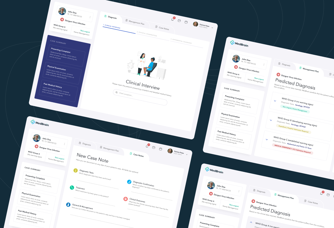


MedBrain is a clinical navigator that guides physicians through every step of the diagnostic process. A GPS for doctors in low-income nations. The project includes:
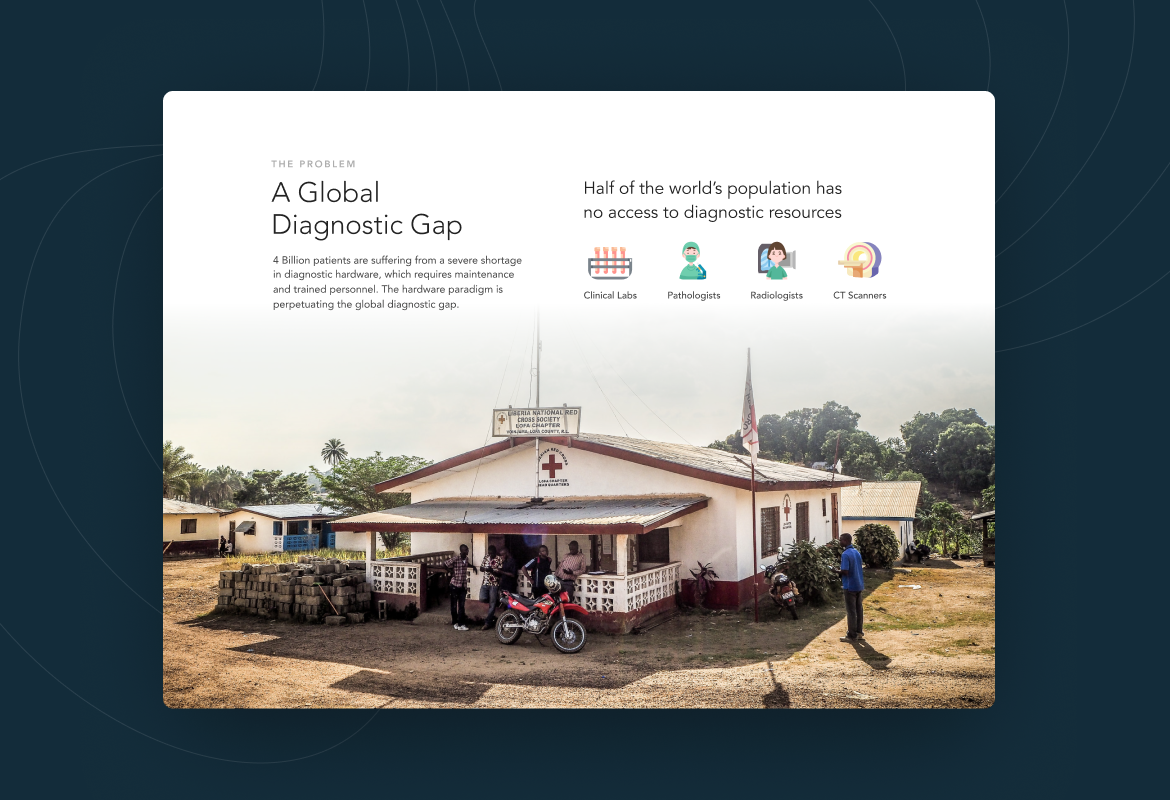
MedBrain is a company offering low-cost medical diagnostics to developing nations. They use data science—instead of expensive, frequently unavailable medical machinery—to accurately diagnose with basic primary care resources, and offer physicians a series of different clinical pathways—like different GPS routes—tailored to the resources available.
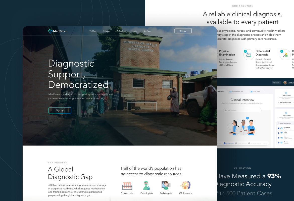
In this project, we were challenged to create a well-made landing page for WordPress. On the introductory page, they wanted a looping video background without any kind of ‘play’ button since it was just an automatic looping video.
Our client gave us a chance to explore our creativity and liked to hear some suggestions from our team. Thus, they didn’t give us too many specific requests. Otherwise, they provided some original pictures that we could use as creative assets.
To exceed our client’s expectations, we created a well-mad landing page—for WordPress—with a minimalist, clean, and photo-centric design style. Other than that, we tried to create a simpler design with a sans serif font and minimal color palette.
We optimized the roles of visual hierarchy and the white space to create a sophisticated design look. With a bold contrast between font size and spacing, the design looks more modern and stylish.
Like any other projects we handled, the feedback notes from our client became the ultimate challenge we need to cope with. There were a couple of revisions we did to meet our client’s expectations.
In the first revision, we made some adjustments like removing some copies in the solution section and using another paragraph instead in a larger, border, and more centered typography settings in the section. Aside, we also made some arrangements for the layout setting. Here, we needed to revise the reading pattern, changing it from the right side to the left side to ease the visitor’s eye tracking while reading the website content.
Meanwhile, in the second revision, we needed to make some modifications to our design. We needed to revise the typography and layout set to create an icon for the Internal Validation page and make it simpler in a list form that the users can access from the landing page, by clicking on an icon in the Public Test Cases section.
With all ups and downs, we are completely happy working with MedBrain and delivering what our client wants. This moment gave us an opportunity to widen our scope and leverage our connections within the industry. Because at the end of the day, we believe that our client's satisfaction is the ultimate goal that our team aims to achieve. Also, it becomes the driver of our business.