EventProposal Design


This one is an event proposal design that we made for one of our clients. This presentation highlights our client’s planning and management services that we delivered in a simple and clean manner.
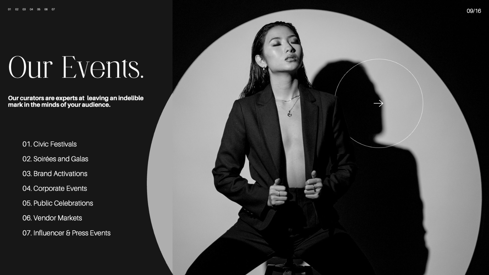
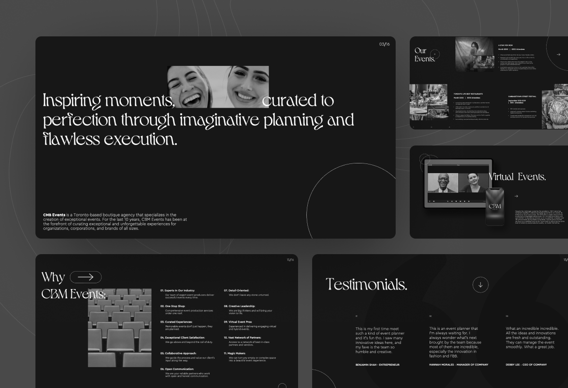
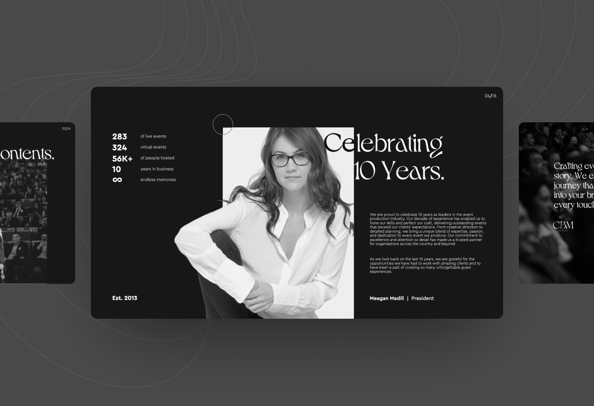
CMB Events is a Toronto-based boutique agency that specializes in the creation of exceptional events. For the last 10 years, they have been at the forefront of curating exceptional and unforgettable experiences for organizations, corporations, and brands of all sizes.
In this project, we were challenged to create a modern and editorial design event proposal for our client in Adobe Illustrator. This is the continuation project for the previous one that we handled. The design requires the use of minimal color, black and white. We were free to use any kind of font as long as it can create a modern, chic, feminine, and sophisticated look. Along with that, we were allowed to use stock photos to achieve aesthetic values in the design.
To tackle the challenge of our client, we create a design that focuses on clear and concise messaging, with an emphasis on typography, whitespace, and imagery. The minimalist approach helps to communicate the key elements of the service in an uncluttered and easy-to-understand manner.
The design utilizes a neutral color palette, with pops of accent colors used to highlight important information. The presentation is organized into clear sections, with each section focusing on a specific aspect of event planning and management. The design is professional, yet approachable, making it ideal for communicating the services offered by recent planning and management companies to clients.
Revision notes from our client became the major challenge that we had to deal with. To make our client happy with our work, we need to make some adjustments like resizing the image, changing the pictures, and rearranging the layout.
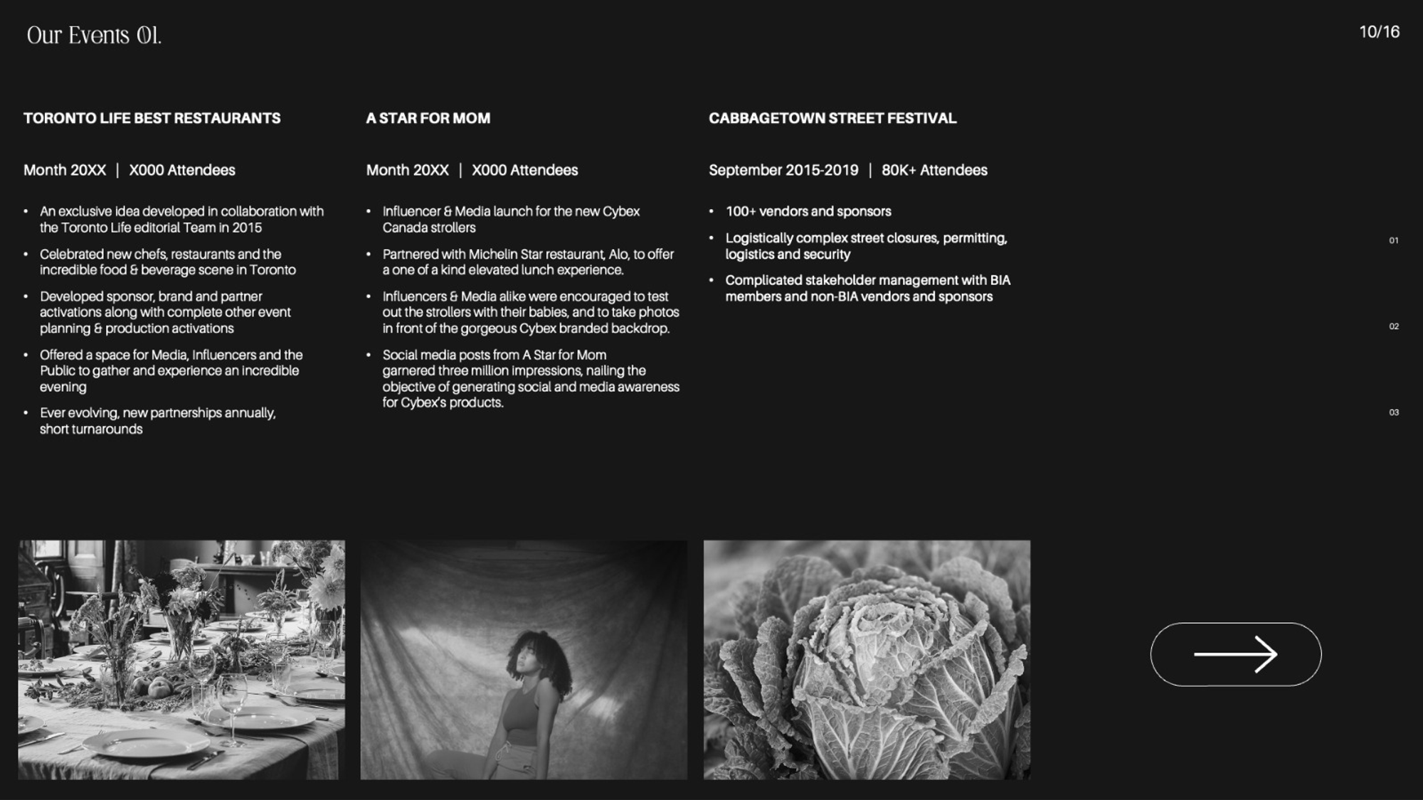
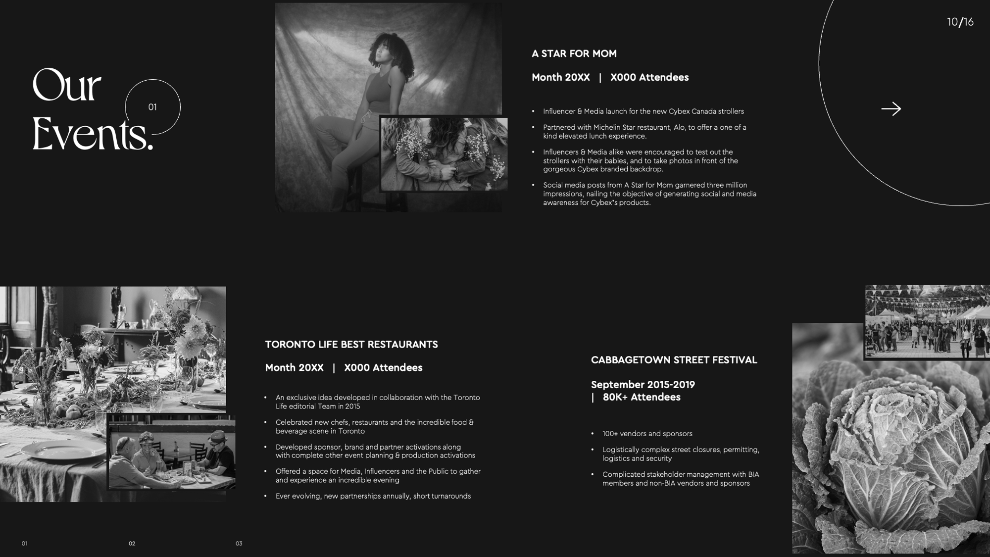
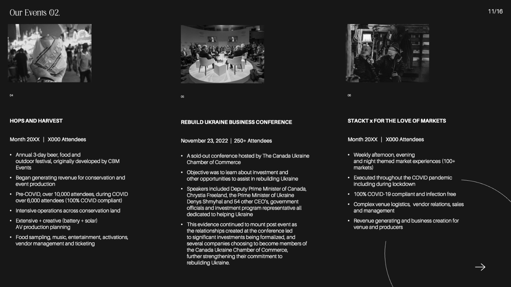
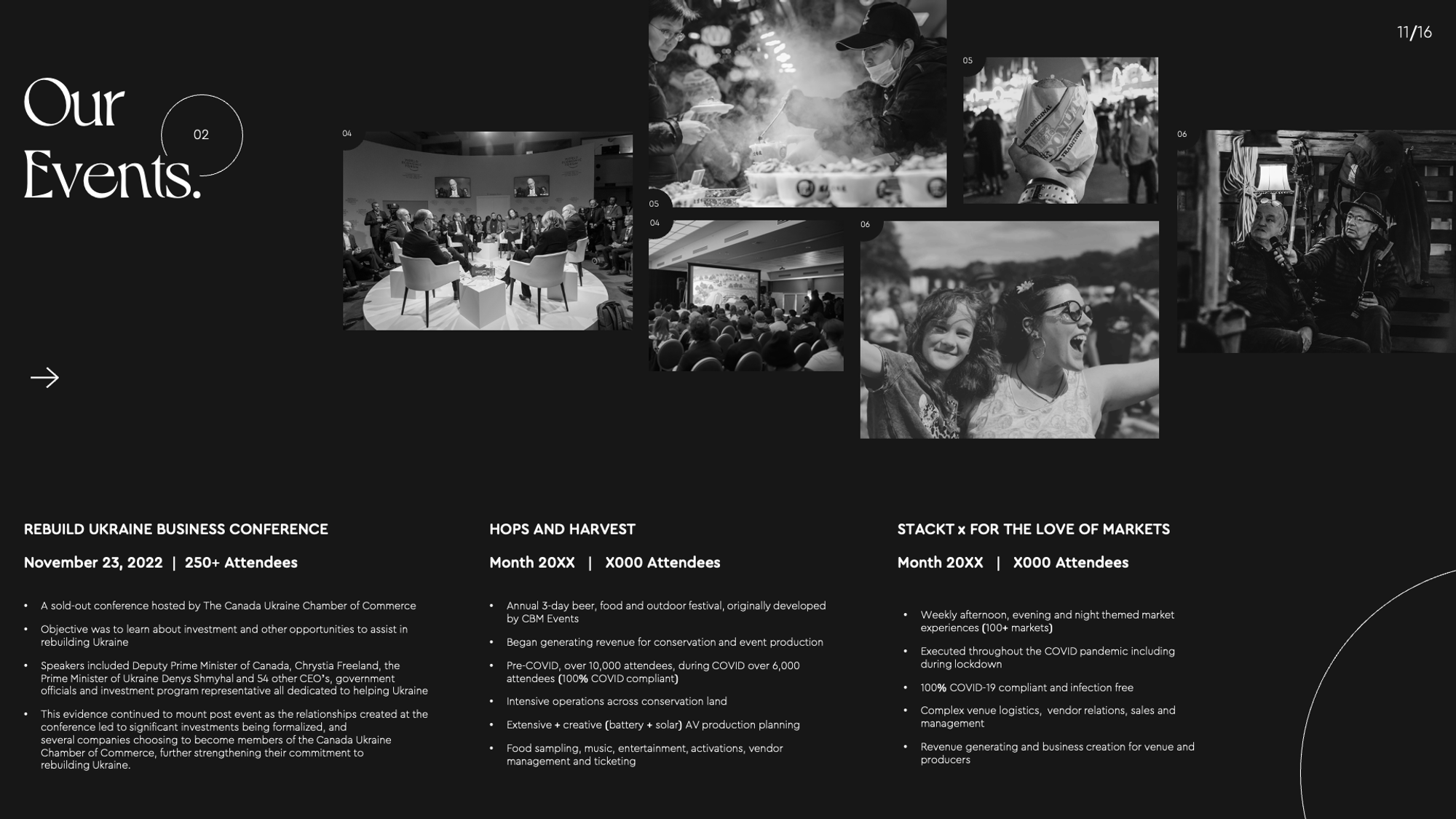
For example on slides 10 and 11, we needed to change the layout since there was a lot of information included.
The challenge was we had to put all of the content into the design while considering whitespace and readability aspects. Thus, we changed the overall layout for those slides to be more agile with unconventional picture placements. As a result, we created a more spacious design without leaving the aesthetics values.
Interpreting information and story is a tricky thing that we regularly deal with. In this case, we were challenged to visualize the ideas and messages whereas the visual asset provided by the client was limited. Thus, we needed to think creatively to deliver the information as accurately as possible.
We are completely happy to work with our client and finish this project. There were so many lessons we took during the creative until the revision process. All the notes gave us the courage to break our limits and explore our creativity. We believe that there is no bad design, but it’s all about interpretation and how we deliver the story through visual design.